在数据展示中使用图表来分享自己的见解,是个非常常见的方法。
这也是Tableau、Power BI这类商业智能仪表盘持续流行的原因之一,这些工具为数据提供了精美的图形解释。
当然了,这些工具也有着不少缺点,比如不够灵活,无法让你自己创建设计。
当你对图表展示要求定制化时,编程也许就比较适合你,比如Echarts、D3.js。
今天小F给大家介绍一个用Python制作可视化报表的案例,主要是使用到Dash+Tailwindcss。
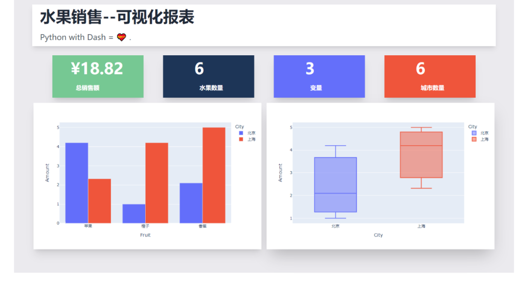
可视化报表效果如下,水果销售情况一览~
Dash是基于Plotly搭建的Dashbord框架,支持Python、R和Julia。使用Dash,你可以创建自定义响应式仪表板。
相关文档
说明:https://dash.plotly.com/introduction
案例:https://dash.gallery/Portal/
源码:https://github.com/plotly/dash-sample-apps/
Tailwindcss则是一个实用程序优先的CSS框架,用于快速构建自定义界面。

“这种框架只适用于那种只会实现页面布局美化元素而不关心实现业务逻辑的前端”。
看看别人对它的评价,对于无交互的图表,完全足够了。
相关文档
说明:https://www.tailwindcss.cn/docs
GitHub:https://github.com/tailwindlabs/tailwindcss
下面就给大家讲解下如何通过Dash+Tailwindcss搭建可视化报表~
首先安装相关的Python库,然后导入。
import
dash
import pandas as pd
import plotly.express as px
from dash import dcc, html
使用到了Pandas、Plotly、dash这三个Python库。
我们需要把Tailwindcss的CDN作为external_script,并将其传递给我们的应用程序实例,这样我们才可以成功使用Tailwindcss。
# 导入tailwindcss的CDN
external_script = ["https://tailwindcss.com/", {"src": "https://cdn.tailwindcss.com"}]

# 创建Dash实例
app = dash.Dash(
    __name__,
    external_scripts=external_script,
)
app.scripts.config.serve_locally = True
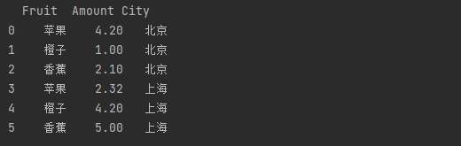
使用Pandas创建水果销售数据,随便虚构了一个。
# 创建数据
df = pd.DataFrame(
    {
        "Fruit": ["苹果", "橙子", "香蕉", "苹果", "橙子", "香蕉"],
        "Amount": [4.2, 1.0, 2.1, 2.32, 4.20, 5.0],
        "City": ["北京", "北京", "北京", "上海", "上海", "上海"],
    }
)

print(df)
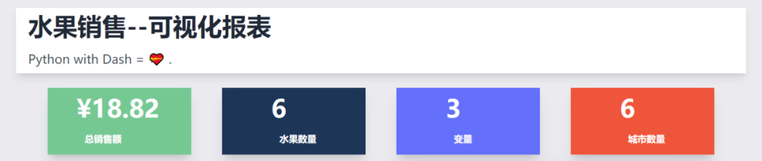
结果如下,3列6行,包含水果、销售额、城市列。
处理一下相关的数据,水果单数、销售总额、城市单数、变量数。
# 水果单数
fruit_count = df.Fruit.count()
# 销售总额
total_amt = df.Amount.sum()
# 城市单数
city_count = df.City.count()
# 变量数
variables = df.shape[1]
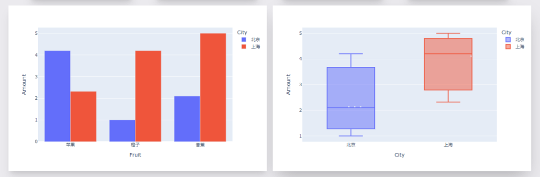
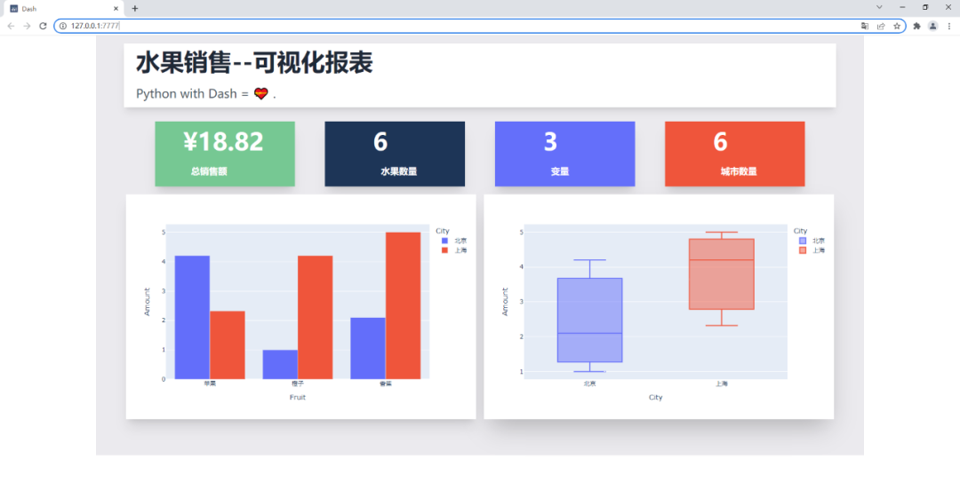
创建图表实例,一个柱状图、一个箱型图。
# 柱状图1, 不同水果不同城市的销售额
fig = px.bar(df, x="Fruit", y="Amount", color="City", barmode="group")

# 箱型图1, 不同城市的销售额分布情况
fig1 = px.box(df, x="City", y="Amount", color="City")
效果如下。
剩下就是文字模块啦,文字+CSS样式。
其中排版布局美化,通过Tailwindcss来实现。
app.layout = html.Div(
html.Div(
children=[
html.Div(
children=[
html.H1(children="水果销售--可视化报表", className=" py-3 text-5xl font-bold text-gray-800"),
html.Div(
children="""Python with Dash = 💝 .""",
className="text-left prose prose-lg text-2xl py-3 text-gray-600",
),
],
className="w-full mx-14 px-16 shadow-lg bg-white -mt-14 px-6 container my-3 ",
),
html.Div(
html.Div(
children=[
html.Div(
children=[
f"¥{total_amt}",
html.Br(),
html.Span("总销售额", className="text-lg font-bold ml-4"),
],
className=" shadow-xl py-4 px-14 text-5xl bg-[#76c893] text-white font-bold text-gray-800",
),
html.Div(
children=[
fruit_count,
html.Br(),
html.Span("水果数量", className="text-lg font-bold ml-4"),
],
className=" shadow-xl py-4 px-24 text-5xl bg-[#1d3557] text-white font-bold text-gray-800",
),
html.Div(
children=[
variables,
html.Br(),
html.Span("变量", className="inline-flex items-center text-lg font-bold ml-4"),
],
className=" shadow-xl py-4 px-24 text-5xl bg-[#646ffa] text-white font-bold text-gray-800",
),
html.Div(
children=[
city_count,
html.Br(),
html.Span("城市数量"
, className="text-lg font-bold ml-4"),
],
className="w-full shadow-xl py-4 px-24 text-5xl bg-[#ef553b] text-white font-bold text-gray-800",
),
],
className="my-4 w-full grid grid-flow-rows grid-cols-1 lg:grid-cols-4 gap-y-4 lg:gap-[60px]",
),
className="flex max-w-full justify-between items-center ",
),
html.Div(
children=[
html.Div(
children=[
dcc.Graph(id="example-graph", figure=fig),
],
className="shadow-xl w-full border-3 rounded-sm",
),
html.Div(
children=[
dcc.Graph(id="example-graph1", figure=fig1),
],
className="w-full shadow-2xl rounded-sm",
),
],
className="grid grid-cols-1 lg:grid-cols-2 gap-4",
),
],
className="bg-[#ebeaee] flex py-14 flex-col items-center justify-center ",
),
className="bg-[#ebeaee] container mx-auto px-14 py-4",
)
效果如下。
最后启动程序代码。
if __name__ == '__main__':
    # debug模式, 端口7777
    app.run_server(debug=True, threaded=True, port=7777)
    # 正常模式, 网页右下角的调试按钮将不会出现
    # app.run_server(port=7777)
这样就能在本地看到可视化大屏页面,浏览器打开如下地址。
http://127.0.0.1:7777
以后制作的图表不仅能在线展示,还能实时更新,属实不错~
好了,今天的分享到此结束,大家可以自行去动手练习。