泰勒图是Karl E. Taylor于2001年首先提出(JGR:Summarizing multiple aspects of model performance in a single diagram),主要用来比较几个气象模式模拟的能力,因此该表示方法在气象领域使用最多,但是在其他自然科学领域也有一定的应用。泰勒图本质上是巧妙的将模型的相关系数(correlation coefficient)、中心均方根误差(centered root-mean-square)和标准差(standard Deviation)三个评价指标整合在一张极坐标图上,其基于的便是三者之间构成的余弦关系。standard deviation 标准差:
RMSE 均方根误差
由余弦定理
代进去很容易证明
基础脚本:taylorDiagram.py
#!/usr/bin/env python
# Copyright: This document has been placed in the public domain.
"""
Taylor diagram (Taylor, 2001) implementation.
Note: If you have found these software useful for your research, I would
appreciate an acknowledgment.
"""
__version__ = "Time-stamp: <2018-12-06 11:43:41 ycopin>"
__author__ = "Yannick Copin "
import numpy as NP
import matplotlib.pyplot as PLT
class TaylorDiagram(object):
"""
Taylor diagram.
Plot model standard deviation and correlation to reference (data)
sample in a single-quadrant polar plot, with r=stddev and
theta=arccos(correlation).
"""
def __init__(self, refstd,
fig=None, rect=111, label='_', srange=(0, 1.5), extend=False):
"""
Set up Taylor diagram axes, i.e. single quadrant polar
plot, using `mpl_toolkits.axisartist.floating_axes`.
Parameters:
* refstd: reference standard deviation to be compared to
* fig: input Figure or None
* rect: subplot definition
* label: reference label
* srange: stddev axis extension, in units of *refstd*
* extend: extend diagram to negative correlations
"""
from matplotlib.projections import PolarAxes
import mpl_toolkits.axisartist.floating_axes as FA
import mpl_toolkits.axisartist.grid_finder as GF
self.refstd = refstd # Reference standard deviation
tr = PolarAxes.PolarTransform()
# Correlation labels
rlocs = NP.array([0, 0.2, 0.4, 0.6, 0.7, 0.8, 0.9, 0.95, 0.99, 1])
if extend:
# Diagram extended to negative correlations
self.tmax = NP.pi
rlocs = NP.concatenate((-rlocs[:0:-1], rlocs))
else:
# Diagram limited to positive correlations
self.tmax = NP.pi/2
tlocs = NP.arccos(rlocs) # Conversion to polar angles
gl1 = GF.FixedLocator(tlocs) # Positions
tf1 = GF.DictFormatter(dict(zip(tlocs, map(str, rlocs))))
# Standard deviation axis extent (in units of reference stddev)
self.smin = srange[0] * self.refstd
self.smax = srange[1] * self.refstd
ghelper = FA.GridHelperCurveLinear(
tr,
extremes=(0, self.tmax, self.smin, self.smax),
grid_locator1=gl1, tick_formatter1=tf1)
if fig is None:
fig = PLT.figure()
ax = FA.FloatingSubplot(fig, rect, grid_helper=ghelper)
fig.add_subplot(ax)
# Adjust axes
ax.axis["top"].set_axis_direction("bottom") # "Angle axis"
ax.axis["top"].toggle(ticklabels=True, label=True)
ax.axis["top"].major_ticklabels.set_axis_direction("top")
ax.axis["top"].label.set_axis_direction("top")
ax.axis["top"].label.set_text("Correlation")
ax.axis["left"
].set_axis_direction("bottom") # "X axis"
ax.axis["left"].label.set_text("Standard deviation")
ax.axis["right"].set_axis_direction("top") # "Y-axis"
ax.axis["right"].toggle(ticklabels=True)
ax.axis["right"].major_ticklabels.set_axis_direction(
"bottom" if extend else "left")
if self.smin:
ax.axis["bottom"].toggle(ticklabels=False, label=False)
else:
ax.axis["bottom"].set_visible(False) # Unused
self._ax = ax # Graphical axes
self.ax = ax.get_aux_axes(tr) # Polar coordinates
# Add reference point and stddev contour
l, = self.ax.plot([0], self.refstd, 'k*',
ls='', ms=10, label=label)
t = NP.linspace(0, self.tmax)
r = NP.zeros_like(t) + self.refstd
self.ax.plot(t, r, 'k--', label='_')
# Collect sample points for latter use (e.g. legend)
self.samplePoints = [l]
def add_sample(self, stddev, corrcoef, *args, **kwargs):
"""
Add sample (*stddev*, *corrcoeff*) to the Taylor
diagram. *args* and *kwargs* are directly propagated to the
`Figure.plot` command.
"""
l, = self.ax.plot(NP.arccos(corrcoef), stddev,
*args, **kwargs) # (theta, radius)
self.samplePoints.append(l)
return l
def add_grid(self, *args, **kwargs):
"""Add a grid."""
self._ax.grid(*args, **kwargs)
def add_contours(self, levels=5, **kwargs):
"""
Add constant centered RMS difference contours, defined by *levels*.
"""
rs, ts = NP.meshgrid(NP.linspace(self.smin, self.smax),
NP.linspace(0, self.tmax))
# Compute centered RMS difference
rms = NP.sqrt(self.refstd**2 + rs**2 - 2*self.refstd*rs*NP.cos(ts))
contours = self.ax.contour(ts, rs, rms, levels, **kwargs)
return contours
def test1():
"""Display a Taylor diagram in a separate axis."""
# Reference dataset
x = NP.linspace(0, 4*NP.pi, 100)
data = NP.sin(x)
refstd = data.std(ddof=1) # Reference standard deviation
# Generate models
m1 = data + 0.2*NP.random.randn(len(x)) # Model 1
m2 = 0.8*data + .1*NP.random.randn(len(x)) # Model 2
m3 = NP.sin(x-NP.pi/10) # Model 3
# Compute stddev and correlation coefficient of models
samples = NP.array([ [m.std(ddof=1), NP.corrcoef(data, m)[0, 1]]
for m in (m1, m2, m3)])
fig = PLT.figure(figsize=(10, 4))
ax1 = fig.add_subplot(1, 2, 1, xlabel='X', ylabel='Y')
# Taylor diagram
dia = TaylorDiagram(refstd, fig=fig, rect=122, label="Reference",
srange=(0.5, 1.5))
colors = PLT.matplotlib.cm.jet(NP.linspace(0, 1, len(samples)))
ax1.plot(x, data, 'ko', label='Data')
for i, m in enumerate([m1, m2, m3]):
ax1.plot(x, m, c=colors[i], label='Model %d' % (i+1))
ax1.legend(numpoints=1, prop=dict(size='small'), loc='best')
# Add the models to Taylor diagram
for i, (stddev, corrcoef) in enumerate(samples):
dia.add_sample(stddev, corrcoef,
marker='$%d$' % (i+1), ms=10, ls='',
mfc=colors[i], mec=colors[i],
label="Model %d" % (i+1))
# Add grid
dia.add_grid()
# Add RMS contours, and label them
contours = dia.add_contours(colors='0.5')
PLT.clabel(contours, inline=1, fontsize=10, fmt='%.2f')
# Add a figure legend
fig.legend(dia.samplePoints,
[ p.get_label() for p in dia.samplePoints ],
numpoints=1, prop=dict(size='small'), loc='upper right')
return dia
def test2():
"""
Climatology-oriented example (after iteration w/ Michael A. Rawlins).
"""
# Reference std
stdref = 48.491
# Samples std,rho,name
samples = [[25.939, 0.385, "Model A"],
[29.593, 0.509, "Model B"],
[33.125, 0.585, "Model C"],
[29.593, 0.509, "Model D"],
[71.215, 0.473, "Model E"],
[27.062, 0.360, "Model F"],
[38.449, 0.342, "Model G"],
[35.807, 0.609, "Model H"],
[17.831, 0.360, "Model I"]]
fig = PLT.figure()
dia = TaylorDiagram(stdref, fig=fig, label='Reference', extend=True)
dia.samplePoints[0].set_color('r') # Mark reference point as a red star
# Add models to Taylor diagram
for i, (stddev, corrcoef, name) in enumerate(samples):
dia.add_sample(stddev, corrcoef,
marker='$%d$' % (i+1), ms=10, ls='',
mfc='k', mec='k',
label=name)
# Add RMS contours, and label them
contours = dia.add_contours(levels=5, colors='0.5') # 5 levels in grey
PLT.clabel(contours, inline=1, fontsize=10, fmt='%.0f')
dia.add_grid() # Add grid
dia._ax.axis[:].major_ticks.set_tick_out(True) # Put ticks outward
# Add a figure legend and title
fig.legend(dia.samplePoints,
[ p.get_label() for p in dia.samplePoints ],
numpoints=1, prop=dict(size='small'), loc='upper right')
fig.suptitle("Taylor diagram", size='x-large') # Figure title
return dia
if __name__ == '__main__':
dia = test1()
dia = test2()
PLT.show()
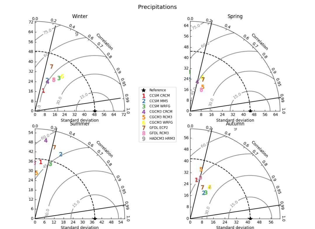
测试脚本:test_taylor_4panel.py
#!/usr/bin/env python
__version__ = "Time-stamp: <2018-12-06 11:55:22 ycopin>"
__author__ = "Yannick Copin "
"""
Example of use of TaylorDiagram. Illustration dataset courtesy of Michael
Rawlins.
Rawlins, M. A., R. S. Bradley, H. F. Diaz, 2012. Assessment of regional climate
model simulation estimates over the Northeast United States, Journal of
Geophysical Research (2012JGRD..11723112R).
"""
from taylorDiagram import TaylorDiagram
import numpy as NP
import matplotlib.pyplot as PLT
# Reference std
stdrefs = dict(winter=48.491,
spring=44.927,
summer=37.664,
autumn=41.589)
# Sample std,rho: Be sure to check order and that correct numbers are placed!
samples = dict(winter=[[17.831, 0.360, "CCSM CRCM"],
[27.062, 0.360, "CCSM MM5"
],
[33.125, 0.585, "CCSM WRFG"],
[25.939, 0.385, "CGCM3 CRCM"],
[29.593, 0.509, "CGCM3 RCM3"],
[35.807, 0.609, "CGCM3 WRFG"],
[38.449, 0.342, "GFDL ECP2"],
[29.593, 0.509, "GFDL RCM3"],
[71.215, 0.473, "HADCM3 HRM3"]],
spring=[[32.174, -0.262, "CCSM CRCM"],
[24.042, -0.055, "CCSM MM5"],
[29.647, -0.040, "CCSM WRFG"],
[22.820, 0.222, "CGCM3 CRCM"],
[20.505, 0.445, "CGCM3 RCM3"],
[26.917, 0.332, "CGCM3 WRFG"],
[25.776, 0.366, "GFDL ECP2"],
[18.018, 0.452, "GFDL RCM3"],
[79.875, 0.447, "HADCM3 HRM3"]],
summer=[[35.863, 0.096, "CCSM CRCM"],
[43.771, 0.367, "CCSM MM5"],
[35.890, 0.267, "CCSM WRFG"],
[49.658, 0.134, "CGCM3 CRCM"],
[28.972, 0.027, "CGCM3 RCM3"],
[60.396, 0.191, "CGCM3 WRFG"],
[46.529, 0.258, "GFDL ECP2"],
[35.230, -0.014, "GFDL RCM3"],
[87.562, 0.503, "HADCM3 HRM3"]],
autumn=[[27.374, 0.150, "CCSM CRCM"],
[20.270, 0.451, "CCSM MM5"],
[21.070, 0.505, "CCSM WRFG"],
[25.666, 0.517, "CGCM3 CRCM"],
[35.073, 0.205, "CGCM3 RCM3"],
[25.666, 0.517, "CGCM3 WRFG"],
[23.409, 0.353, "GFDL ECP2"],
[29.367, 0.235, "GFDL RCM3"],
[70.065, 0.444, "HADCM3 HRM3"]])
# Colormap (see http://www.scipy.org/Cookbook/Matplotlib/Show_colormaps)
colors = PLT.matplotlib.cm.Set1(NP.linspace(0,1,len(samples['winter'])))
# Here set placement of the points marking 95th and 99th significance
# levels. For more than 102 samples (degrees freedom > 100), critical
# correlation levels are 0.195 and 0.254 for 95th and 99th
# significance levels respectively. Set these by eyeball using the
# standard deviation x and y axis.
#x95 = [0.01, 0.68] # For Tair, this is for 95th level (r = 0.195)
#y95 = [0.0, 3.45]
#x99 = [0.01, 0.95] # For Tair, this is for 99th level (r = 0.254)
#y99 = [0.0, 3.45]
x95 = [0.05, 13.9] # For Prcp, this is for 95th level (r = 0.195)
y95 = [0.0, 71.0]
x99 = [0.05, 19.0] # For Prcp, this is for 99th level (r = 0.254)
y99 = [0.0, 70.0]
rects = dict(winter=221,
spring=222,
summer=223,
autumn=224)
fig = PLT.figure(figsize=(11,8))
fig.suptitle("Precipitations", size='x-large')
for season in ['winter','spring','summer','autumn']:
dia = TaylorDiagram(stdrefs[season], fig=fig, rect=rects[season],
label='Reference')
dia.ax.plot(x95,y95,color='k')
dia.ax.plot(x99,y99,color='k')
# Add samples to Taylor diagram
for i,(stddev,corrcoef,name) in enumerate(samples[season]):
dia.add_sample(stddev, corrcoef,
marker='$%d$' % (i+1), ms=10, ls='',
#mfc='k', mec='k', # B&W
mfc=colors[i], mec=colors[i], # Colors
label=name)
# Add RMS contours, and label them
contours = dia.add_contours(levels=5, colors='0.5') # 5 levels
dia.ax.clabel(contours, inline=1, fontsize=10, fmt='%.1f')
# Tricky: ax is the polar ax (used for plots), _ax is the
# container (used for layout)
dia._ax.set_title(season.capitalize())
# Add a figure legend and title. For loc option, place x,y tuple inside [ ].
# Can also use special options here:
# http://matplotlib.sourceforge.net/users/legend_guide.html
fig.legend(dia.samplePoints,
[ p.get_label() for p in dia.samplePoints ],
numpoints=1, prop=dict(size='small'), loc='center')
fig.tight_layout()
PLT.savefig('test_taylor_4panel.png')
PLT.show()
样图效果: